In this part of the tutorial we will look at how the distribution of resources determined in the previous section affects the costs of running the business.
- Firstly, look at the graphs in the results program. As we have drawn several graphs, we will first arrange them in a more orderly manner.
- Tile the graphs by selecting Graphs/Tile.
Tip: to arrange the graphs in a logical order (from lower right to top left of view), click on them in the following order before selecting Graphs/Tile: Operating Costs, Installed and Incremental Units, Capital Expenditure, Capacities, Utilisation Ratio, Connections).
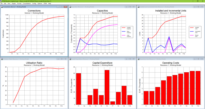
Figure 1: View showing tiled graphs
In the previous part of the tutorial, we added a location element to the model, which increased the forecast of how much resource should be installed. Hence, the utilisation ratio was low for the first few years. In addition, initial capital expenditure was considerably higher, as ten units (each costing EUR 5000) were required in Y1, compared with just one unit in Y1 and two units in Y2 with one-for-one distribution. Operating costs were also higher, as each additional unit of resource incurs a maintenance cost. Overall, there is a significant financial cost of providing a service in several geographical locations. We need to determine what to charge customers to make the service profitable.
We will first look at the depreciation, which is cost spread over the lifetime of an asset.
- Right-click on the Capital Expenditure graph and then select Draw Similar….
- Select Depreciation and Amortisation in the Graphs tab and press OK to draw the graph.
Note: by default, depreciation in STEM is straight-line depreciation over the lifetime of the resource. Hence, in this case, the capital cost of EUR 5000 will be depreciated over the 5-year lifetime of each resource unit, namely EUR 1000 per year.
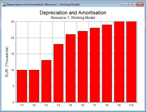
Figure 2: The Depreciation and Amortisation graph for Resource 1
You can see that depreciation is EUR 10,000 in Y1 and Y2, when ten units of the resource are installed, and then increases in Y3 and Y4 as additional resource units are installed.
- Now draw the graph for resource Operating Charge, which is the total charge for operations (Depreciation and Amortisation + Operating Costs) and is used to calculate profitability.
Note: you can change the existing graph in situ by right-clicking on it and selecting Change Selections…, then selecting Operating Charge in the Graphs tab.
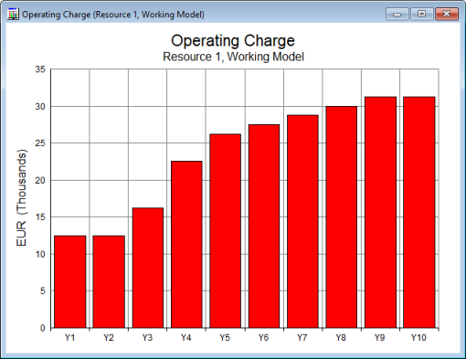
Figure 3: The Operating Charge graph for Resource 1
The operating charge essentially tells you how much money you need to make each year to balance the cost of the capability. It would also be useful to consider the cost incurred on a per-customer basis.
- Draw the Revenue and Operating Charge per Average Connection graph for Service 1.
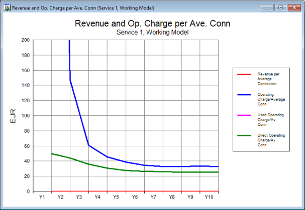
Figure 4: The Revenue and Operating Charge per Average Connection graph for Service 1
Note: as the utilisation ratio is initially low, the cost per customer will initially be very high. Right-click on the y-axis and select Format Axis… to change the maximum value shown from 1400 to 200 in order to make the graph more informative, as shown.
The blue line shows the operating charge divided by the average number of customers in a period, giving you an operating charge per average connection. From Y5 onwards, this is < EUR 40.00 per year; this would equate to a tariff of approximately EUR 3.00 per customer per month.
In the next part of this tutorial, we will explore the effect of adding a customer tariff to the model.
 Things that you should have seen and understood
Depreciation, Operating Charge, Revenue and Operating Charge per Average Connection
Change Selections